Flyers are a popular way to promote events and attract attendees. They serve as visual invitations, conveying essential information about the event to potential participants. When designing a flyer, one of the crucial elements to consider is the background. The background sets the tone, grabs attention, and enhances the overall appeal of the flyer. In this blog post, we will discuss some helpful tips on how to choose the perfect flyer background for your event.
Consider the Event Theme and Purpose:
The first step in selecting a flyer background is to consider the theme and purpose of your event. Is it a formal business conference, a lively music concert, or a festive community gathering? Understanding the essence of the event will help you narrow down your choices and ensure that the background aligns with the overall message you want to convey.
Think About Colors:
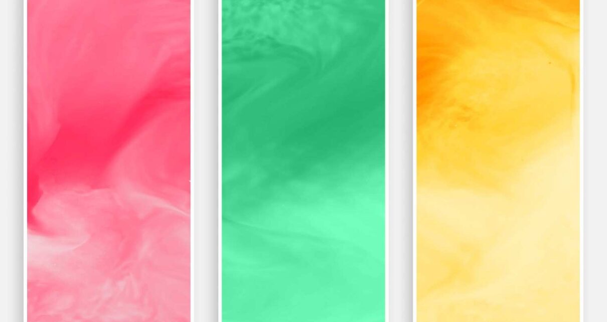
Colors play a vital role in evoking emotions and setting the mood for an event. Choose colors that complement each other and reflect the atmosphere you want to create. For example, warm tones like red, orange, and yellow can create a sense of energy and excitement, while cool tones like blue and green can evoke calmness and tranquility. Experiment with different color combinations to find the one that best represents your event.
Use High-Quality Images:
When selecting a background image for your flyer, opt for high-quality visuals that capture attention and maintain clarity when printed or viewed digitally. Blurry or pixelated images can give a negative impression and deter people from taking your event seriously. Stock photo websites and creative commons platforms are excellent resources for finding professional and eye-catching images.
Consider Typography Placement:
Take into account where the text and important information will be placed on your flyer. Ensure that the background does not clash with the text, making it hard to read or understand. Choosing a background with a consistent color or pattern that allows the text to stand out will enhance the overall readability and effectiveness of your flyer.
Balance and Contrast:
Achieving a balance between the background and the other elements on your flyer is crucial. If the background is too busy or overpowering, it can overshadow the important information or make the design appear cluttered. On the other hand, if the background lacks visual interest, it may fail to grab attention. Striking the right balance and ensuring sufficient contrast will make your flyer visually appealing and engaging.
Consider the Printing Medium:
Before finalizing your flyer background, consider the medium through which it will be distributed. If you plan to print physical copies, take into account factors like paper quality and ink limitations. Some backgrounds may look excellent on digital screens but may not translate well when printed. Test the flyer design on both digital and print mediums to ensure it looks impressive in all formats.
Seek Feedback:
It’s always helpful to seek feedback from others before finalizing your flyer design. Show your potential background options to colleagues, friends, or even target audience members to get their opinions. They may provide valuable insights and perspectives that can help you make an informed decision.
FAQs:
Q1: Can I use multiple backgrounds on a single flyer?
A1: Using multiple backgrounds can create a busy and confusing design. It’s generally advisable to stick to one background to maintain visual coherence and clarity.
Q2: Are there any specific fonts that work best with certain backgrounds?
A2: While there are no hard and fast rules, it’s essential to choose a font style and size that complements the background. Experiment with different fonts and sizes to ensure readability and visual harmony.
Q3: Should the background images be directly related to the event?
A3: Not necessarily. The background image can be indirectly related to the event theme as long as it harmonizes with the overall design. However, if it’s too disconnected, it may confuse potential attendees.
Q4: How can I ensure my flyer background is visually appealing to everyone?
A4: It’s challenging to cater to everyone’s preferences, but choosing a balanced and visually pleasing background with complementary colors and engaging visuals will have a broad appeal.
Conclusion:
Selecting the perfect flyer background requires careful consideration of the event theme, purpose, colors, image quality, typography placement, balance, and contrast. Remember to consider the printing medium and seek feedback from others to ensure your flyer design achieves its intended impact. By following these tips and guidelines, you can create an eye-catching and effective promotional flyer for your event.
Also Read:- Essential Tips For Choosing The Perfect Custom Soap Boxes


